The Grade Is the Gut Punch: Color as Character on a Shoestring

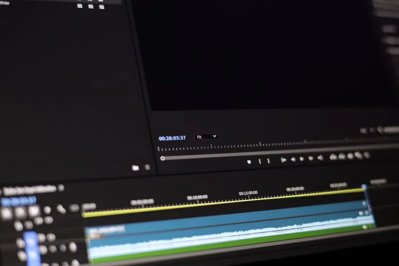
Photo: colorist grading microbudget indie film on monitor in dark studio, via img.freepik.com
There’s a moment in every microbudget edit where the movie stops feeling like a pile of files and starts feeling like a film. It rarely arrives when the picture lock is approved. It doesn’t come when the temp score finally lands. It comes in the grade, when the first shot stops looking like what the camera recorded and starts looking like what the story meant.
That’s the strange power of color on a small indie. A bigger camera can buy you cleaner shadows, but it can’t buy you a mood. A great grade can. And for a US filmmaker working with a post budget that’s closer to a used car than a studio line item, the grade is often the last best chance to make the audience feel something before the credits roll.
The Mood Is in the Midtones
Colorists who work on microbudget films tend to say the same thing: the mistake is chasing a look before you understand the feeling. A director may walk in asking for ‘Wong Kar-wai’ or ‘Fincher’ or ‘that A24 thing,’ but the useful question is simpler. What should the room feel like when the character can’t say what they mean?
On a tiny film, the answer usually lives in the midtones. Shadows get all the drama, but midtones carry skin, walls, and the ordinary spaces where low-budget movies actually live. If the midtones go muddy, the whole film feels tired. If they go too clean and bright, a kitchen-sink drama starts to look like a commercial for dish soap.
The colorists I talked to for this piece kept returning to restraint. A microbudget indie doesn’t need a different color for every act. It needs a consistent emotional temperature, then a few deliberate breaks. Maybe the first half sits in a warm, slightly yellowed apartment. Maybe the second half cools by a few degrees after the argument. The audience won’t say ‘nice grade.’ They’ll say the movie got lonelier.
Skin Tones Are the Story
Here’s the unglamorous truth: on a small film, skin tones are the whole ballgame. Viewers forgive crushed blacks and noisy shadows. They don’t forgive faces that look gray, plastic, or sunburned. When a director has no money for production design, the cast is often the most expensive thing on screen. The grade has to protect that investment.
A working colorist in Chicago put it to me this way: ‘You can stylize the world as much as you want, but the moment the lead’s face stops looking like a person, the audience leaves the movie.’ That’s why so many microbudget grades start with a skin-tone pass before any creative look is applied. It’s not glamorous. It’s triage. And it’s the difference between a film that feels intimate and one that feels accidentally sickly.
Mixed lighting is the usual culprit. A practical lamp, a window, and a cheap LED panel can all be fighting each other in the same shot. A good colorist doesn’t try to make the light look expensive. They make it look intentional. They pull the green out of a fluorescent kitchen. They warm up a face that’s gone cold. They let the background fall off without turning the actor into a cutout.
Contrast Is a Performance
Microbudget directors often ask for a ‘cinematic’ look, which usually means contrast. But contrast isn’t a preset. It’s pacing. A flat image can feel observational and honest. A punchy image can feel heightened and nervous. The grade tells the audience how to hold their breath.
One Austin-based director told me the biggest lesson from her last feature was to stop treating the grade as a final coat of paint. She started thinking of it as a performance note. In the scenes where her lead was lying to herself, she asked the colorist to keep the image deceptively pleasant. In the scenes where the lie was cracking, the contrast came down and the shadows got softer. ‘It wasn’t about making it look bad,’ she said. ‘It was about making the room feel less certain.’
That kind of move costs almost nothing. It doesn’t require a new lens or a bigger lighting package. It requires a director and a colorist who are willing to talk about the scene like adults instead of arguing about a LUT.
The Cheap LUT Trap
Let’s talk about the trap. A LUT is not a grade. It’s a starting point, and a cheap one can be a trapdoor. The standard microbudget move is to slap on a teal-and-orange look from a $20 pack, crank the saturation, and hope the footage holds. Sometimes it does. Often it turns every face into a different kind of wax figure.
The problem is that most LUTs are built for footage that was exposed and lit in a particular way. If your indie was shot in a real apartment with two practical lamps and a window that goes from blue to blown-out in twenty minutes, that LUT is not solving your problem. It’s hiding it. And hiding it usually makes the film look like it’s pretending to be something it isn’t.
Colorists tend to recommend the opposite approach: start neutral, fix the exposure and white balance, get the skin right, then build the look in layers. If you’re working in 8-bit footage, don’t over-flatten the image in camera and then try to rescue it later. Give the grade something to work with. A little contrast in the source is not the enemy.
The Before-and-After Test
The most useful moment in a microbudget grade is often the before-and-after. Not because the after looks fancier, but because it reveals what the film was actually about. I’ve seen directors tear up at a side-by-side where nothing had been added. No VFX. No new sound. Just a face that finally looked warm enough to recognize.
That’s the strange economy of color. A few hundred dollars of a colorist’s time can do more for a tiny film than a rented cinema camera. It can make a living room feel like a memory. It can make a gray afternoon feel like a warning. It can make the audience trust a movie that clearly didn’t have the money to buy their trust outright.
What ‘Expensive’ Actually Means
None of this is about faking a studio picture. A microbudget indie shouldn’t look like it was shot on a backlot. It should look like it knows exactly what it is. The grade can help by making the film feel controlled, intentional, and emotionally legible. That reads as ‘expensive’ to an audience, even when the budget was a spreadsheet full of favors.
So if you’re finishing a small film this year, don’t save the grade for last-minute panic. Save it for the moment when you can still change how the story feels. Sit with your colorist. Talk about skin tones before you talk about looks. Ask what the room should feel like when the character can’t say the thing. Then let the color do the talking.
Because the heart of a movie isn’t always in the dialogue. Sometimes it’s in the midtones.